Size: 750ml
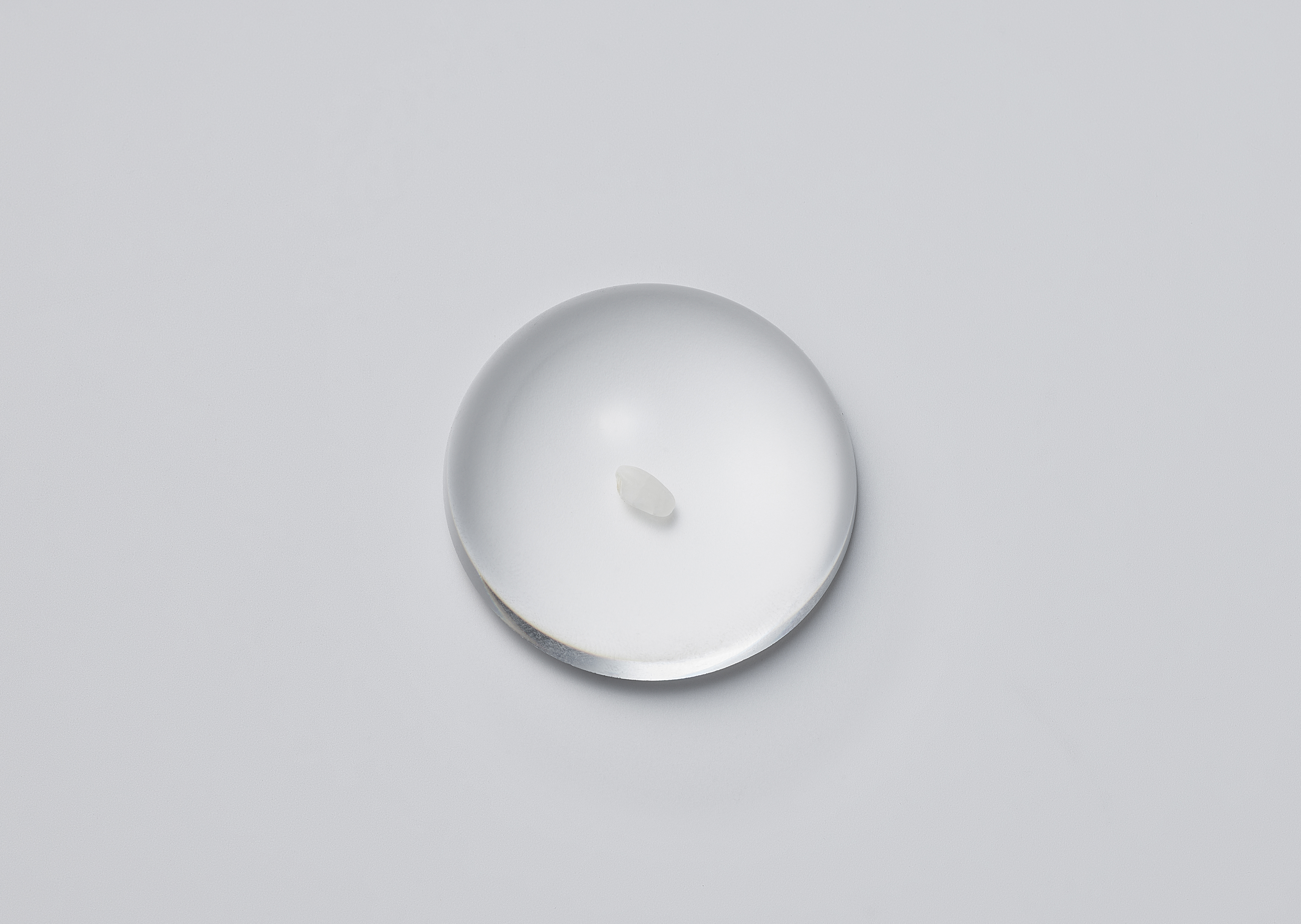
Material: rice
Client: Pocheon ildong
Material: rice
Client: Pocheon ildong
Damun’, the premium label of Pocheon-ildong, Makgeolli, a renowned brewing house with a legacy spanning four generations, underwent a comprehensive rebranding spearheaded by Seoul based MISC STUDIO. This rebranding included the design of their brand identity, packaging, graphics, uniforms, and spatial aesthetics.
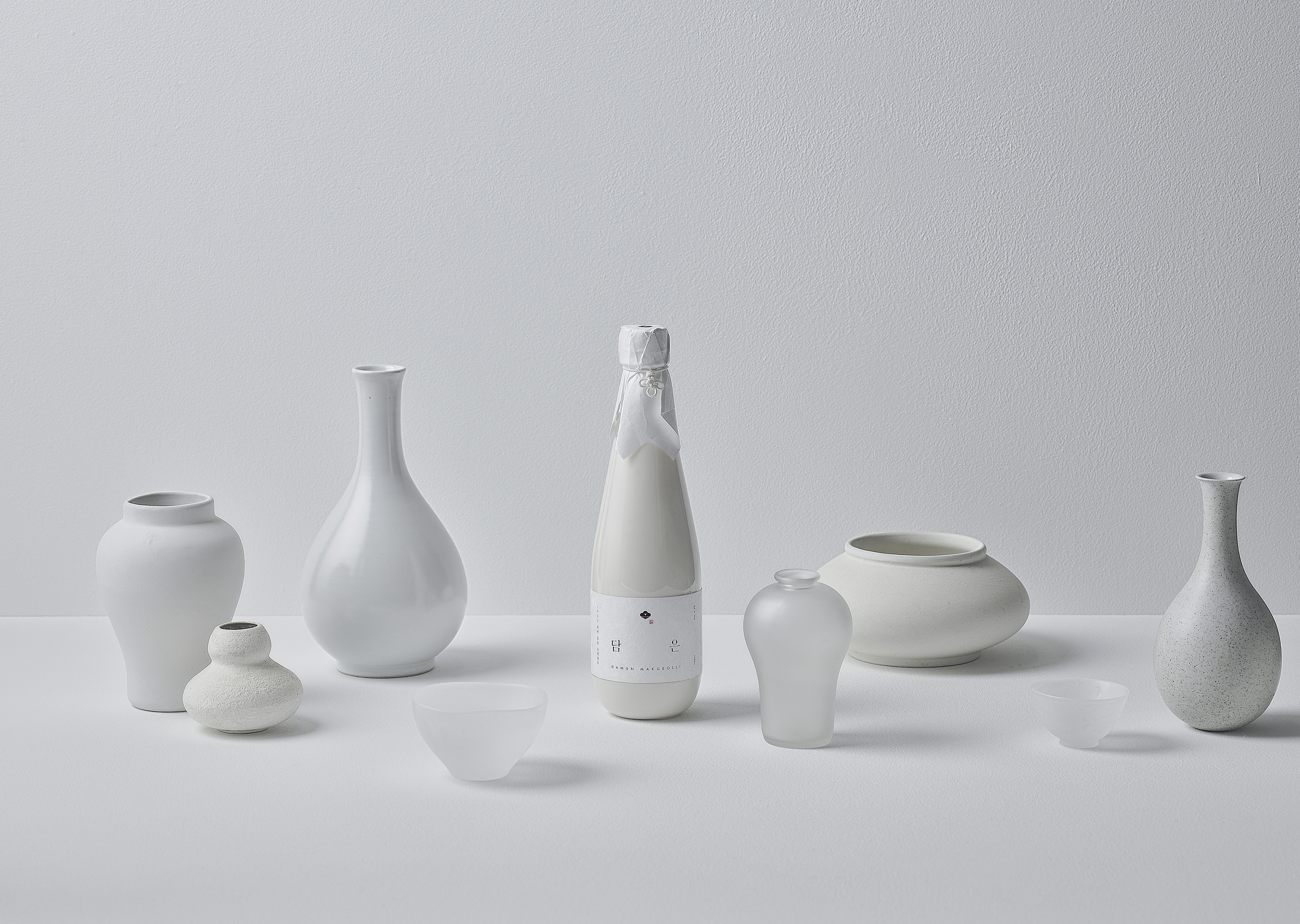
Emerging from the heart of Pocheon-ildong in South Korea, the newly introduced Damun Makgeolli distinguishes itself as a premium brew, fermented from fresh rice. Its characteristics include a gentle, smooth, and clean taste. The product captures the essence of 'clouds', both in its milky white appearance from the fresh rice and its inherent identity. Central to this project was the theme of harmoniously blending the depth of Pocheon-ildong's traditional essence with contemporary aesthetics, using 'clouds' as a key motif. MISC aimed to retain and bridge the contexts of tradition and modernity without overly diverting from the design principles previously established for Damun Makgeolli.
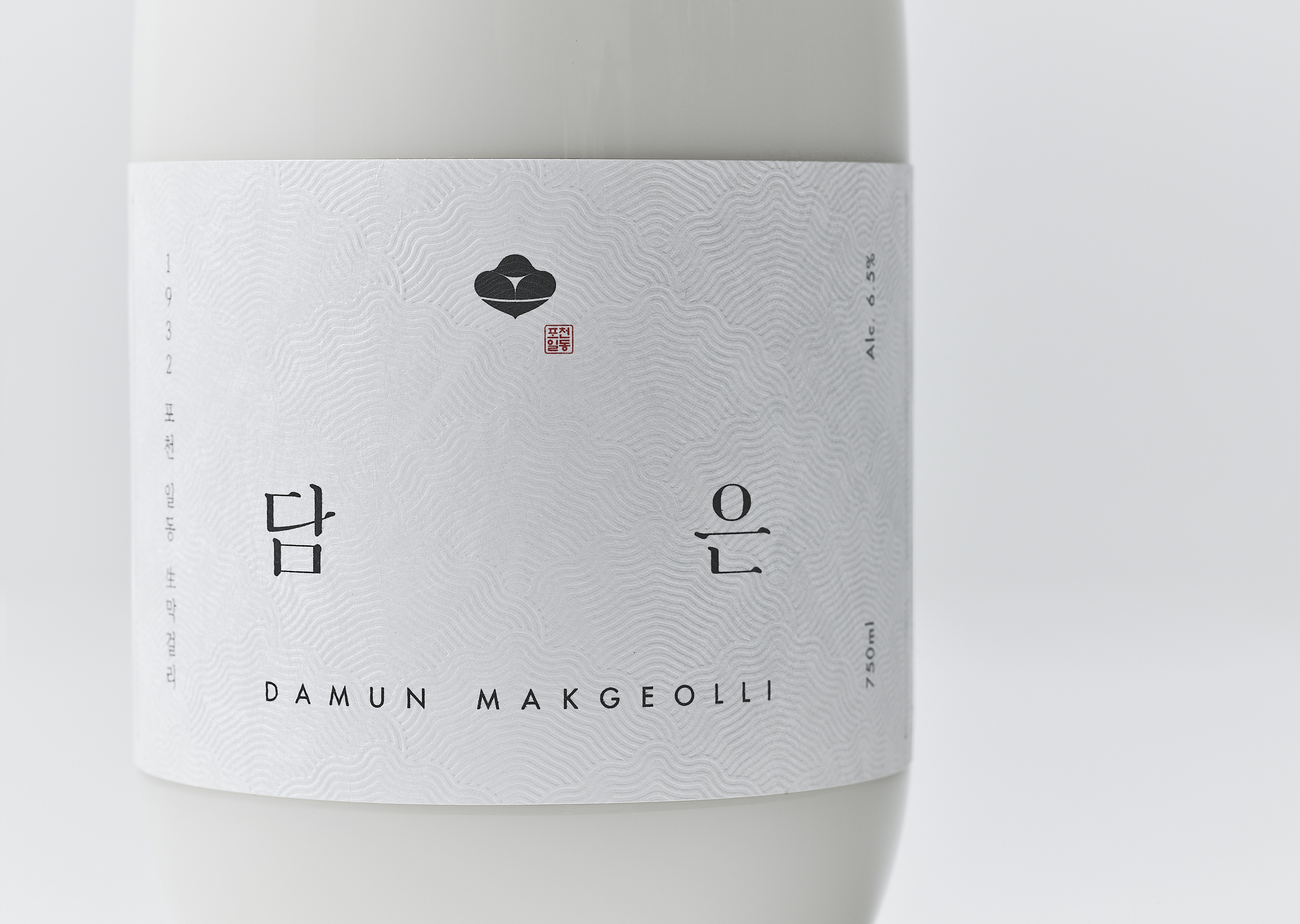
The paramount symbol for Damun captures sunlit clouds as they appear in a soju glass – a design both concise and potent. The textual logo emphasizes the strokes in the words 'Dam' and 'Eun', revealing the strength of time and fluidity, while encapsulating modernity within traditional calligraphy.
The final symbol and text logo are deliberately positioned within the label's whitespace to convey a balance of familiarity and novelty. This is intended to elicit dual emotions in the viewer, akin to savoring the depth of Damun Makgeolli's taste over a prolonged period, rather than seeking immediate gratification.
For the PET bottle label, after dedicated research, a high-cost eco-friendly paper, Tyvek, the only permissible choice under domestic environmental laws, was chosen. The landscape of Pocheon's Unaksan Mountain was subtly incorporated through pattern and embossing, adding a touch of elegance and depth, reminiscent of traditional Korean paper.
The uniform channels traditional Korean simplicity. Modernized for daily wear, it consists of a vest, shirt, and trousers. Different fabrics, each with unique textures, were chosen, and their colors were matched in a tone-on-tone style inspired by the unique hues of makgeolli.
Collaboration with artisans was a significant aspect of this project. As a part of upholding the legacy of Korean tradition, the tie for the makgeolli bottle was hand-knotted by the renowned knot master, Hwang Soon-ja. The 'Saengjok Knot', resembling Damun's cloud motif, is amongst the most iconic and versatile knots crafted by the master.
Damun has reshaped the perception of traditional makgeolli from being just a light, inexpensive drink to a beverage of refined stature. It has thickened the layer of Korean traditional liquor's legacy and elevated the brand's value by striking a balanced representation of Korean design aesthetics.


